When working with print media, it's crucial to be familiar with the terminology specific to this field. Whether you're designing brochures, flyers, or other printed materials, understanding these terms will help you communicate effectively with printers, clients, and other professionals involved in the process. In this article, we will explore some essential terms that every designer should know when working with print media.

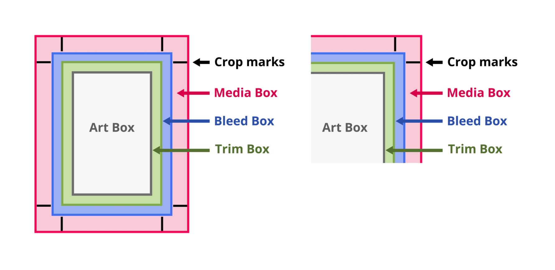
An example of printing marks, including a bleed area.
Bleed: Definition and Importance
Bleed refers to the area of an image or design that extends beyond the final trim size. It ensures that when the paper is trimmed to its final size, there are no white borders or unintended gaps. Design elements, such as background colors or images, should extend into the bleed area. Printers will trim the paper to the specified size, including the bleed, resulting in a seamless and professional-looking finished product.

Cyan (C), Magenta (M), Yellow (Y), and Black (K) paints used in the CMYK printing process.
CMYK: The Four-Color Printing Process
CMYK stands for Cyan, Magenta, Yellow, and Key (Black). It represents the four-color printing process used in print media. If you own a printer, you may already be familiar with the Cyan, Magenta, Yellow, and Black inks that your printer needs in order to work. In CMYK, different combinations of these four colors are used to create a wide range of hues and shades. When designing for print, it's crucial to work in the CMYK color mode to ensure accurate color reproduction. RGB colors used for digital design may need to be converted to CMYK for print.

DPI determines the clarity of a printed image.
DPI and Resolution: Clear and Crisp Print Quality
DPI (Dots Per Inch) refers to the number of dots or pixels per inch in a printed image. It determines the level of detail and sharpness in the print. Higher DPI results in better print quality, while lower DPI may lead to pixelation or a lack of clarity. Resolution, on the other hand, refers to the number of pixels in a digital image. When preparing images for print, it's crucial to use high-resolution images to ensure crisp and clear output. Most print jobs require a minimum of 300 DPI - some printers might require an even higher DPI. In comparison, 72 DPI, or 150 DPI for retina screens, is sufficient enough for images used in websites, web applications, or anything displayed on a digital screen.

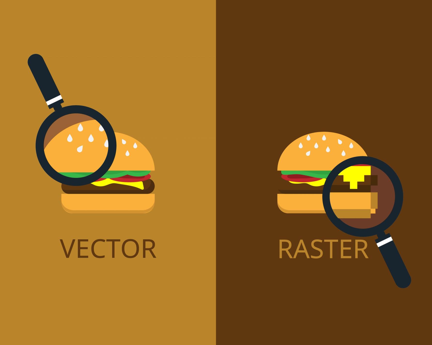
Vector and raster graphics have very different properties.
Vector and Raster Graphics: Understanding the Difference
Vector graphics are created using mathematical equations and are resolution-independent. They can be scaled up or down without losing quality. Raster graphics, on the other hand, are composed of pixels and have a fixed resolution. When working with print media, it's important to understand the difference between vector and raster graphics to ensure the appropriate format is used for different design elements.

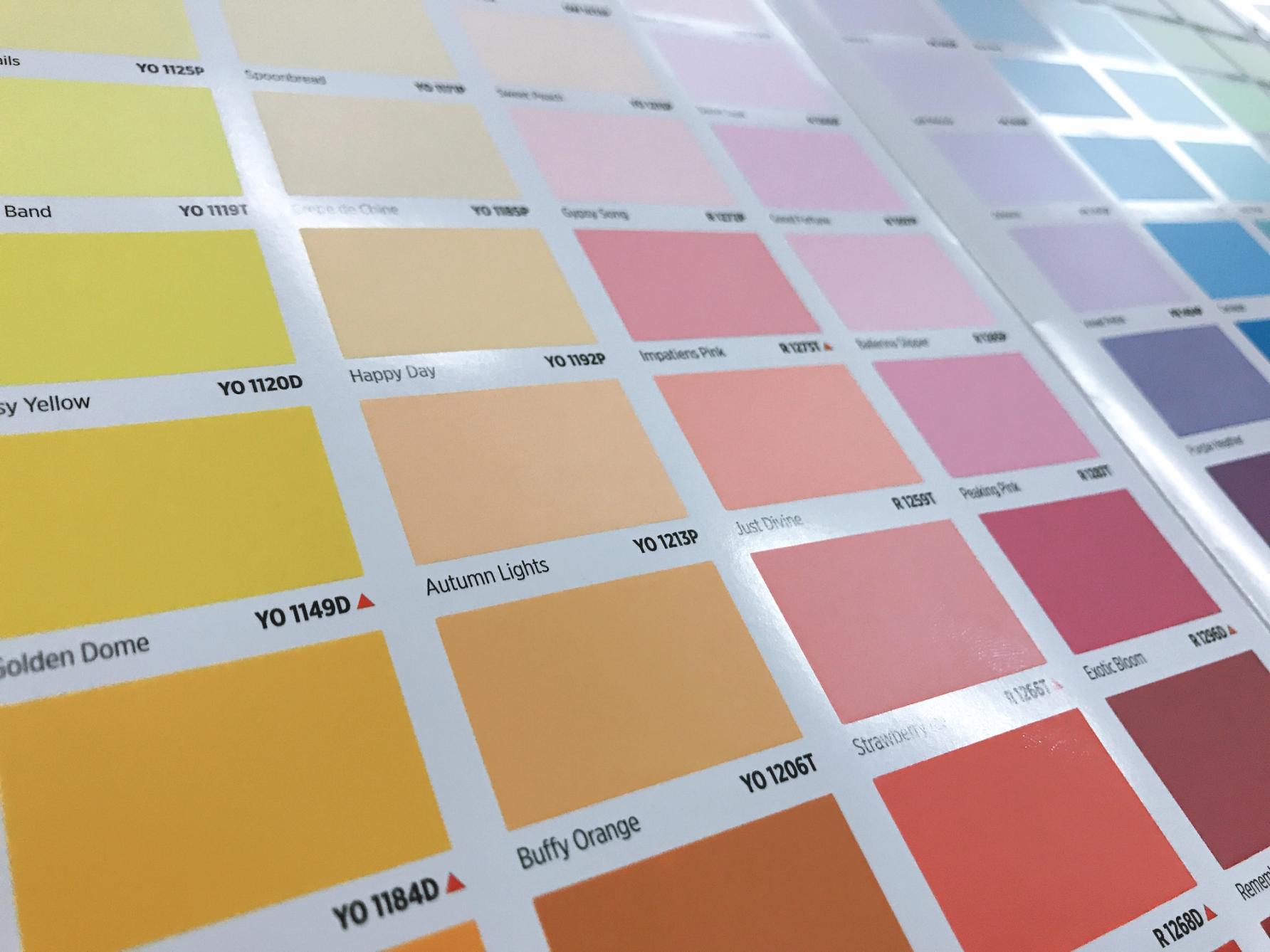
The Pantone Matching System uses standard color codes so that colors can be reproduced consistently throughout the print industry.
Pantone Matching System (PMS): Consistent Color Reproduction
The Pantone Matching System (PMS) is a standardized color matching system used in the printing industry. It assigns unique numbers to specific colors, allowing for consistent color reproduction across different materials and print processes. Designers often use PMS colors for branding elements or specific color requirements that need to be accurately replicated in print.

Inspecting a printed work before mass production is a crucial step in the printing process.
Proofing and Prepress: Ensuring Print Accuracy
Proofing involves reviewing and validating the design before it goes into production. It allows designers and clients to identify and correct any errors, check color accuracy, and ensure the layout is as intended. Prepress refers to the process of preparing the design files for printing, including color separation, imposition, and other necessary adjustments. Understanding proofing and prepress processes is essential to achieve accurate and high-quality print results.

Spot UV is an example of a finishing option you can have applied to print media.
Finishing Options: Enhancing Print Materials
Finishing options refer to the additional processes applied to printed materials to enhance their appearance or functionality. Common finishing options include coatings (such as gloss or matte), embossing, foiling, die-cutting, and binding methods. Understanding different finishing options allows designers to incorporate these elements into their designs effectively.
Mastering Print Media Terminology for Professional Results
By familiarizing yourself with these important terms in print media, you'll be better equipped to communicate with printers, clients, and other professionals involved in the print production process. Remember to consider bleed, work in CMYK, use appropriate resolutions, understand vector and raster graphics, utilize the Pantone Matching System, pay attention to proofing and prepress, and explore various finishing options. Armed with this knowledge, you'll be able to create outstanding print materials that meet the highest standards of quality and professionalism.